
Exploring retro print with CMYK Halftone
We love using shaders to bring high‑end image processing to Paper, and we like to make them fast and easy to tweak. We are introducing an image filter that captures the feel of analog printing. Here's how it works, and how to make it yours.
We all miss old school Photoshop — the textures, the plugins, the obscure tricks. What if we could bring that era to modern web tools, but without long loading spinners and random crashes? That’s one of the many reasons we’re building Paper.
We were excited when the Quartr team asked if we could recreate a discontinued Photoshop plugin: Inklab. This extension offered tons of options for a print-like render, built on halftoning and the CMYK color model. We love the vintage analog feeling it gives. Our goal was to get this feeling with a fast one-pass WebGL solution that renders instantly, without loading spinners.
If you’re looking to expand your visual toolkit, this shader is for you. Let’s dig in.
The shader is running live in your browser right now
How to use the filter
Picture three knobs on a printing press. Here’s a cheat sheet for the controls:
- press:
sizeandgrid noisefor grid structure and overall vibe - ink:
typeandsoftnessfor shape of the ink drops - pigment:
colors,gainandfloodfor a full control over the color palette, we’ll demonstrate those in a bit!
How CMYK halftoning works
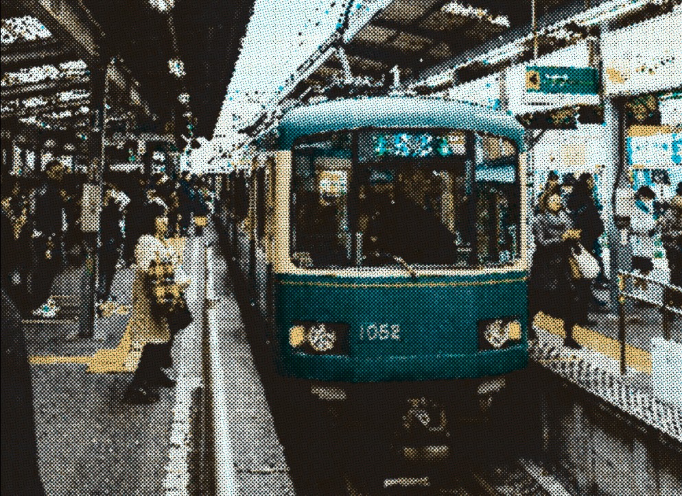
This is based on a classic technique from actual printing: on white paper, you print 4 layers of colored ink dots — cyan (C), magenta (M), yellow (Y), and black (K). The dots on each layer form a halftone pattern, and together the layers combine into a full-color image.
The digital representation usually starts with , , and round dots on a white background. To draw the output color, the basic shader samples the image RGB, converts it to CMYK, and uses the CMYK values directly as a radius for 4 dots. The final RGB color is composed out of 4 dots blended via subtraction.
![]()
Let’s go through the ways to make this render warmer and more realistic.
Step 1: Image sampling
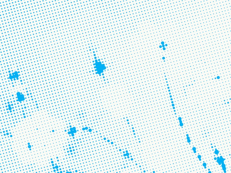
Do you see how some dots are getting cropped? A real print is made from round dots.
The problem is we’re sampling RGB color from the exact pixel position. If you think about an isolated color layer and a halftone grid on it, each cell has a size much bigger than 1x1 pixel. That means we can find very different RGB values within one cell. To draw a round dot we need to take just one RGB color per cell, so we sample RGB only in the center of each dot.
Left: per-pixel sampling, right: center-of-dot sampling
Compared to per-pixel sampling, this eats up some of our GPU power budget. Now, for every pixel, we have to find the 4 closest dot centers and sample them. If we had a bigger budget for computing, we could use the average color across the entire cell, but that’s way too expensive for a real-time filter.
We kept both per-pixel and per-dot-center sampling modes in Paper. Use type to switch between dot (center sampled) and sharp (direct sampled).
Why just circles?
Speaking of dot shape, some halftone tools offer a shape selection, like squares or lines. We tried it in early builds but gave up on the idea for two reasons:
- other shapes don’t really help achieving the analog print look but they take some computing time
- it wouldn’t give us as much freedom for other controls (like
softnessof dot edges andgrid noise, which we’ll talk about right away)
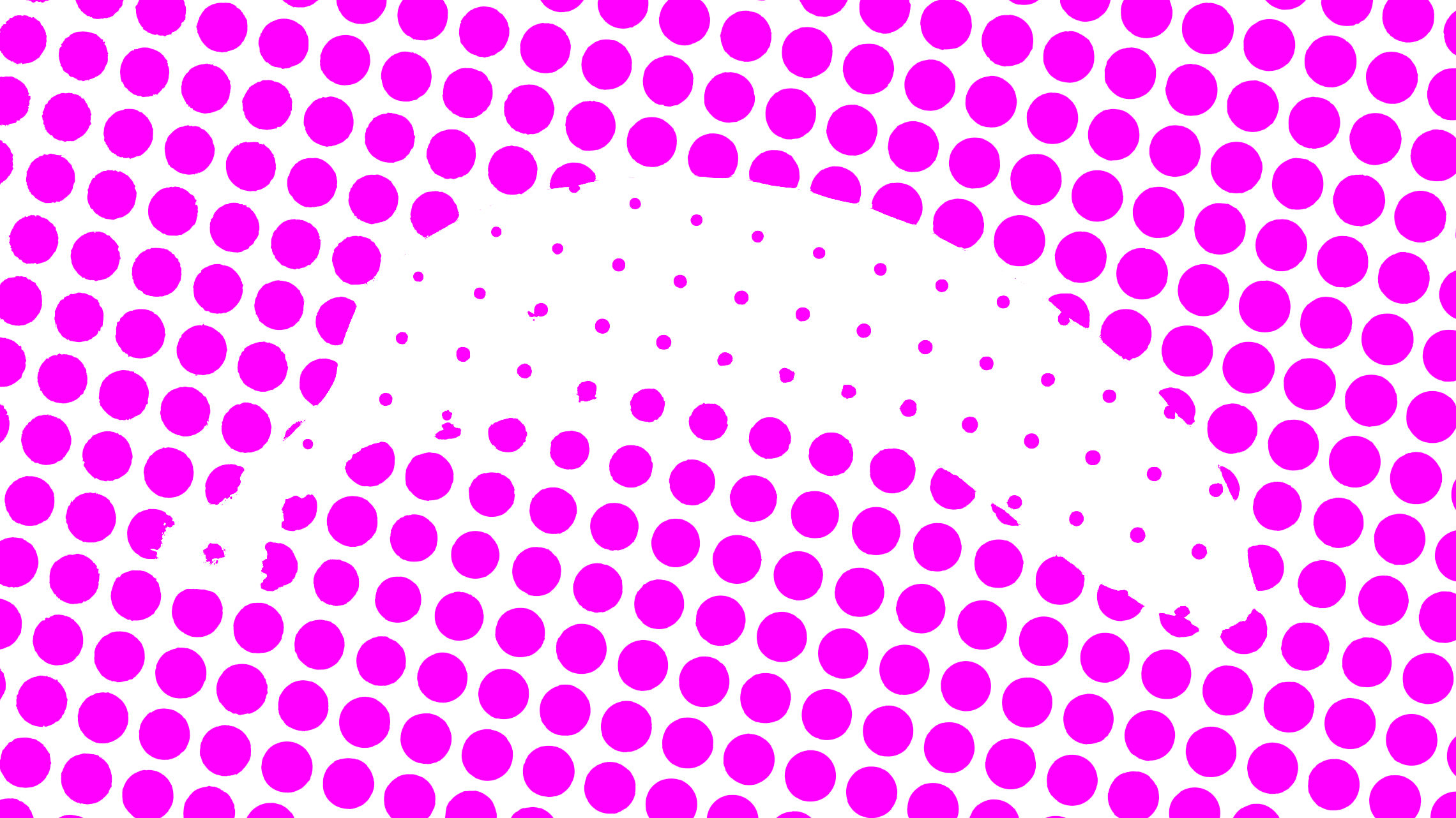
Step 2: overlapping dots
What else can we do to make the dots look more like ink drops? We let them overlap. If you think about physical printing, drops of ink would merge with their neighbors. To achieve this, we let each dot take up to 3 grid cells.
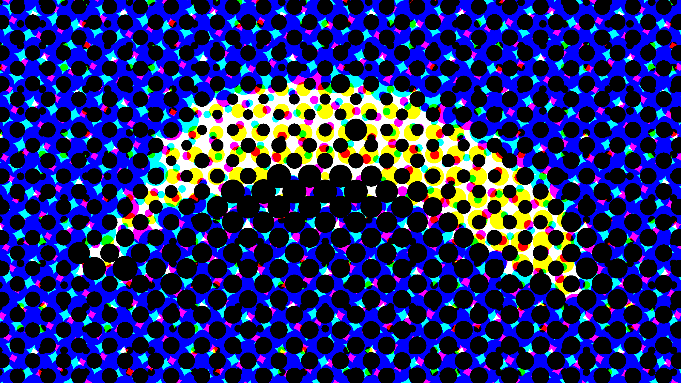
Left: not-overlapping dots, right: overlapping dots
This improvement comes with extra shader complexity: each pixel needs to know not only about the 4 closest colored dots, but also about 8 neighbor dots for each color dot. That’s 36 texture samples. But the visual payoff is worth it!
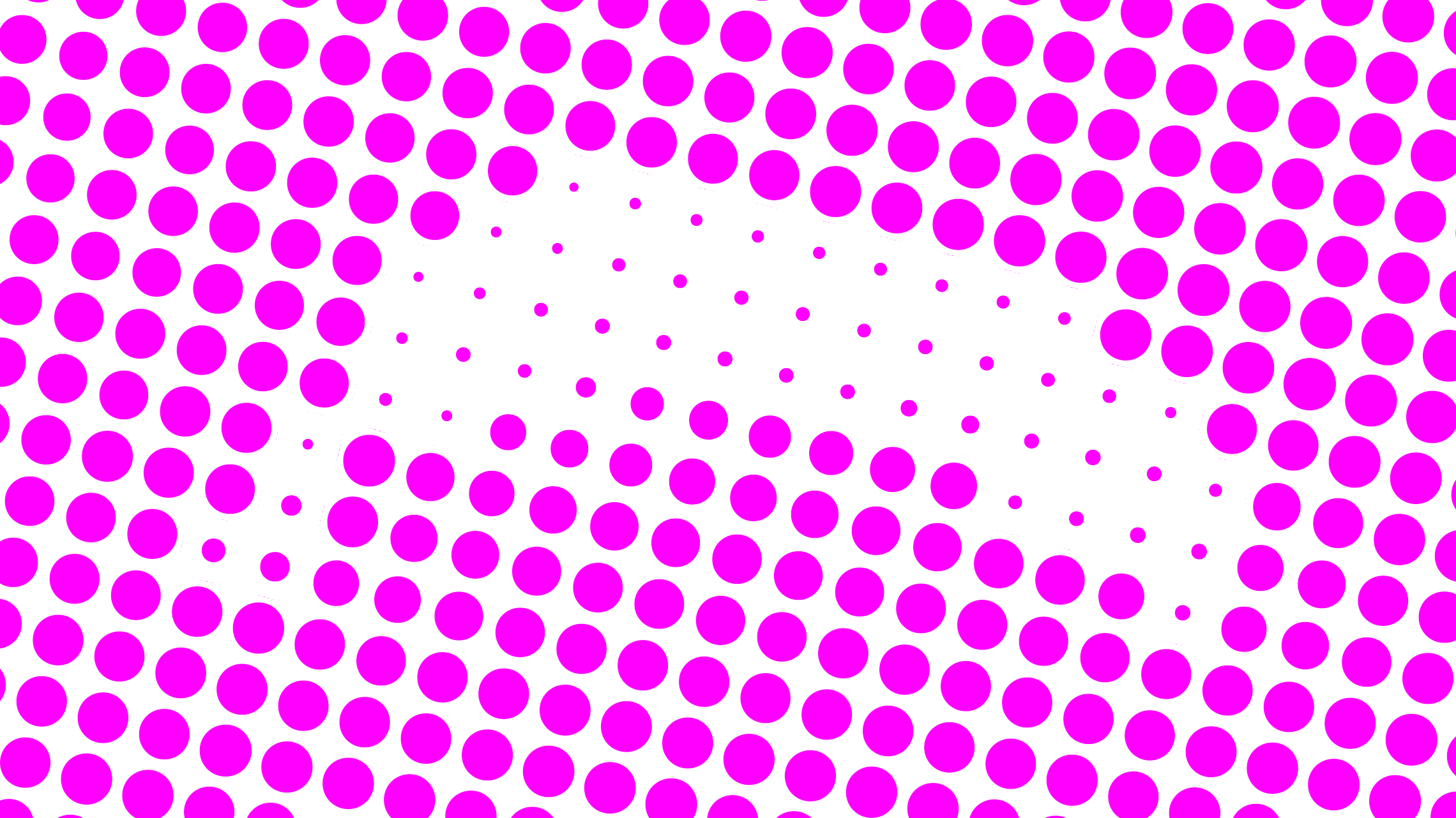
The “gooey” ink look
In real life, ink dots bleed into one another. Since we already let them overlap, we can achieve the bleeding with the “gooey” effect. That gives us the 3rd dot type called ink.
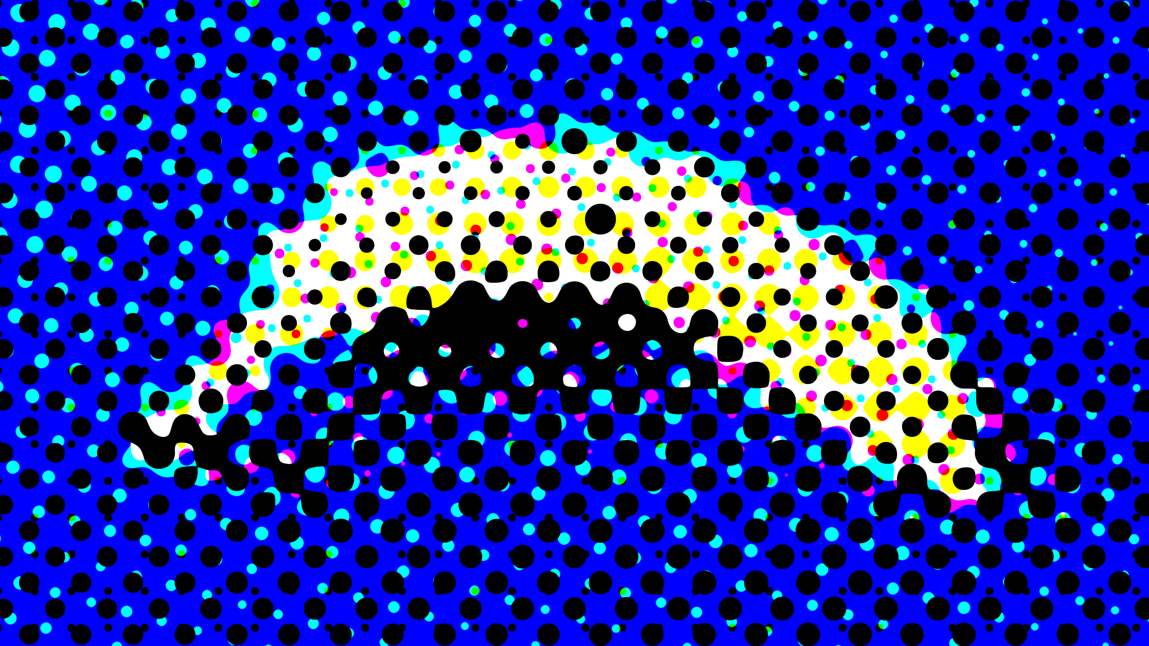
Left: overlapping dots, right: 'gooey' dots
So, if you want a straight pattern, go with dots. If you prefer a more organic, 90’s zine or grunge vibe, switch to ink. Note how the dark parts of the image blend better with the ink dots.
Switch to ink and watch the dots melt together
Step 3: soft edges
The solid CMYK colors blend into the original palette really well already. But it’s also easy (and basically free for performance) to expose a softness parameter for dot edges. You may know that in GLSL, a circle is really just a radial gradient that we “cut” with a step() function. We use a smoothstep() function instead and expose the thresholds to make switching hard pop-art dots to smooth continuous tones easily.
Push softness up to blend the CMYK layers smoothly
Step 4: grid noise
So far so good, but why does the rendering still feel digital? It’s because every dot is perfectly aligned. Would a real print head be perfectly precise? No! An actual printer would have slight jittered movement every time it makes a mark. That’s how we designed the grid noise parameter. It adds a random offset to each dot, nudging them slightly off-center. This turned out to be a breakthrough both for making a grid look more natural and also for creating fun new patterns.
Add grid noise to break the machine-perfect grid
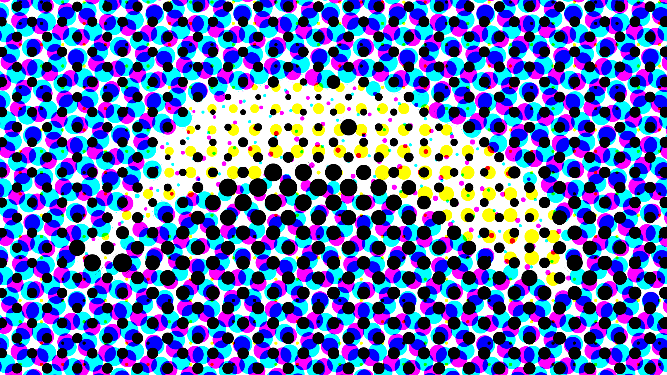
Using custom palette
For mathematically correct RGB/CMYK conversion, we have to use the set of , , , and colors. But this palette looks digital and cold, real CMYK pigments have more warmth and variation. Notice how much better the render looks with more harmonic palette? We use , , , and colors as defaults, but you’re free to adjust them as you like.
Breaking the colors (on purpose)
Both grid noise and adjusted colors have a side effect — the final color no longer matches the uploaded picture perfectly.
When we add a “grid noise” and dots move off of the regular grid, the underlying layers and white background show through the gaps.
When we replace the original CMYK colors with more natural tones, but keep using standard RGB/CMYK conversion and subtraction blending, it skews the final color output.
We can’t afford mathematically correct compensation for these two issues, it would tank performance. Instead, we add a way to manually adjust the dots size for each individual color layer.
The first thing we tried was a simple addition to dot radius for each channel, like “add 0.1 to all the yellow dots.” But we also found it useful to boost only the existing dots, like “make yellows more yellow” or “make blues less blue”. After playing around, we ended up keeping both approaches:
gainsboost what’s already there, it helps when a channel gets lost in the mix.floodsboost the whole layer, it’s good for a “heavy ink” look or darkening the overall image.
Use gain to boost a channel, flood to fatten all dots
Using this shader in the Paper app
Enough theory. Let’s play with this shader in Paper. First let’s run the app and look at the Image filters section in the shaders panel.
Just click or drag the HalftoneCMYK filter onto the canvas, then upload any image from the right panel. You can duplicate the shader frame and start experimenting with different outputs.
So, what can you make with CMYK Halftone?
Before you start tweaking parameters, we suggest you play around with different images and look for contrasts. The quality of your results will depend on the source images. If you have some image editing experience, you will notice this is similar to color grading.
We always create presets for all shaders to give you a starting point, but the possibilities are endless, especially for filters like this with so many parameters to tweak. Try out some presets:
Click the presets to see different looks
Now let’s start tweaking some sliders and getting more results. For instance, by taking advantage of the 4-color layer this effect comes with, you can create those high-contrast retro, posterized looks. Hard edges and saturated colors give that flat, graphic pop-art vibe. Set softness to 0, crank up the contrast, and use a medium dot size.
Each color channel becomes a layer that you can control to focus your image on an accent tone. Below, we bring out the cyan and then blend the other colors into a complementary tone.
You can also use the same color across the three color channels (C, M, Y) to create a duotone effect, or set these colors to a gray shade, just like we did for the grayscale effect in the newspaper preset.
Soft gradients and colorful skies work beautifully with this effect, especially when paired with bold silhouettes that contrast the background, like this butterfly. You can chain together Paper Shaders by exporting them as JPG and using the export as the source for this halftone effect.
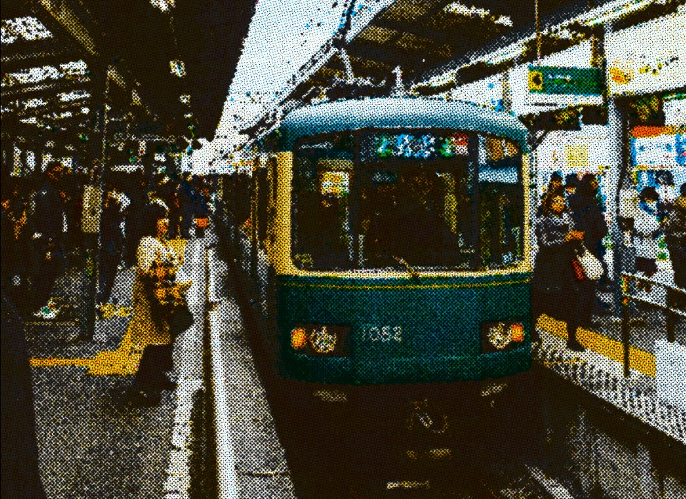
One last experiment worth sharing: take a black and white image with nice contrast and isolate the black layer by removing the color channels (C, M, Y) and the background fill. This gives you a risography effect that you can duplicate, change color, and shift slightly. Now you have a cool chromatic aberration vibe.
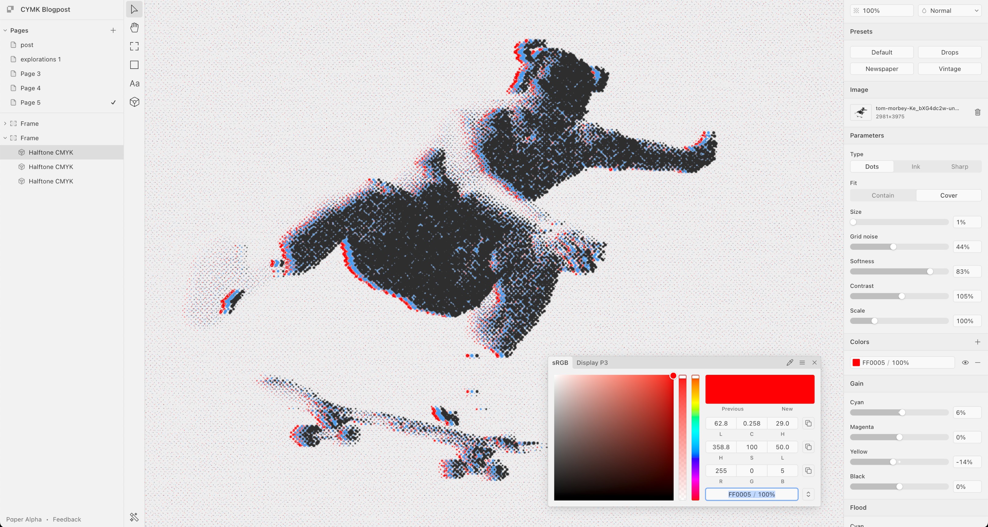
Chromatic aberration effect · Photo by Tom Morbey
The best way to explore this shader is to break it! Open Paper, drag the sliders until it looks wild, then dial it back until it looks cool.